Exposed
Case study
About the project | Exposed
A satirical commerce and networking site that uses critical and speculative design practices to expose gender inequality in the outdoor gear industry
The outdoor gear industry designs gear on a male first basis, ignoring the differing physiology of women. Gear for women is more often than not male gear shrunken down and made pink, otherwise known as “pink it and shrink it”. This leads to issues greater than ill fitting clothing or color preference, including safety, slower progression in sport, and an overall feeling of unwelcomeness.
The final outcome for this project was in the form of a commerce website selling fictional and satirical objects meant to highlight the absurd gear practices in the outdoor gear industry.
The client | Final major project for a Masters Degree in UX at UAL
My role | All the blood, sweat, and tears are mine as this was an individual project. However big thanks to my course mates and professors for the feedback and support.
01
Research
Key readings | Feminism, material culture, speculative design


Initial survey | 252 respondents
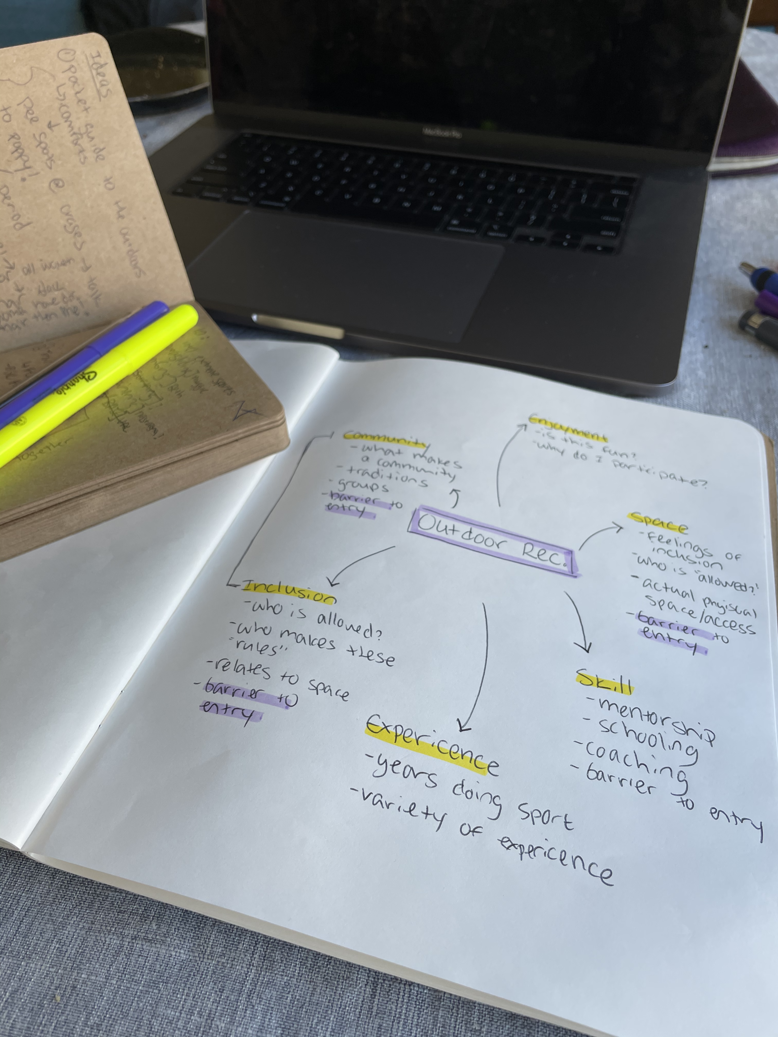
I created a survey to gage the outdoor communities feelings towards women in the outdoors and gear availability specific to them. The outcome of the survey showed me that there was a need for change in the practices surrounding women and gear in the outdoors. As well as a need to make the outdoors a more welcoming and comfortable space for women.

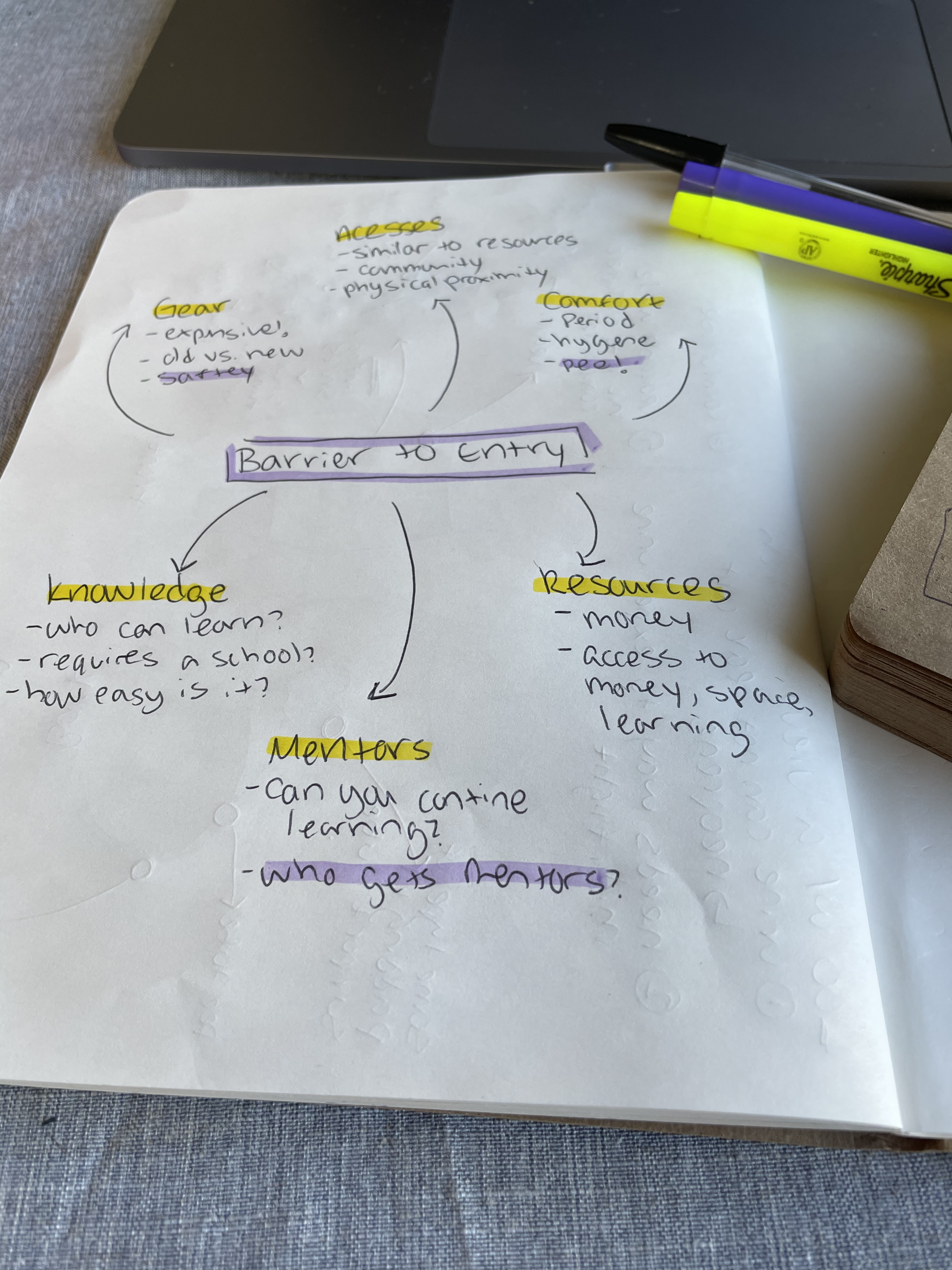
Mind Mapping | Breaking down my initial research
Through mind mapping exercises I was ultimately led to focusing on a very specific issue that most women face in the outdoors; peeing!
Inflight urination system survey | 76 respondents
My research led me to thinking about women and how they deal with urination outside. More specifically it led me to thinking about the sports in which peeing during participation is difficult; air sports like paragliding.
The survey outcome pointed to a definite lack in urination systems for women and an overwhelming want for a better option.

02
Ideation
Drawing from research | Beginning the design process
From my survey results I began to ideate about possible solutions for some sort of wearable urination system. Four main capabilities needed to be met with the system:
wearable while hiking and flying
easy to remove after flight
reusable/eco-friendly
immediate elimination of urine during use

03
Prototyping
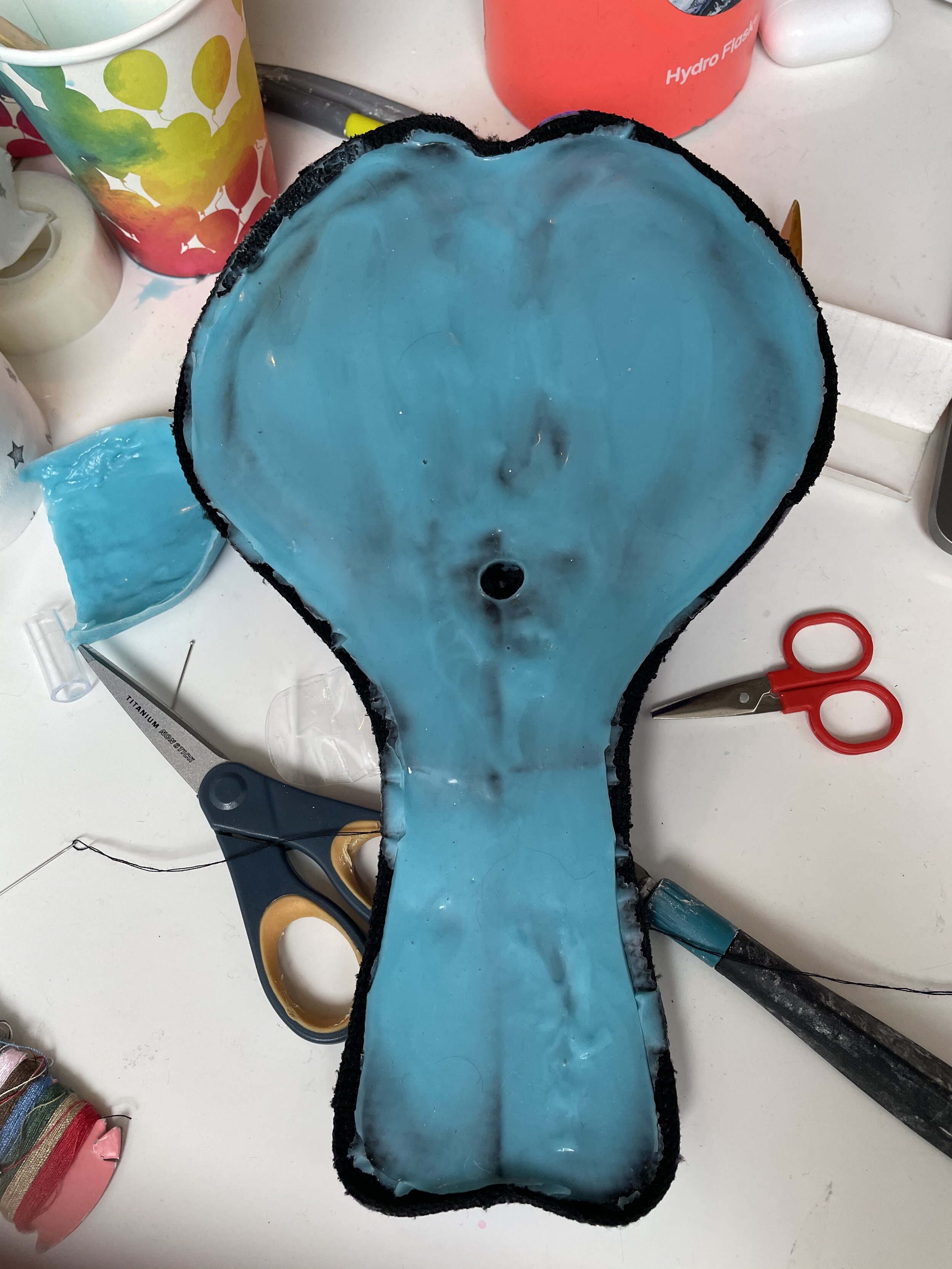
Low-fi | material tests and INITIAL prototypes
My initial prototypes where mainly experimental, trying to learn how to best work with the silicone. Once I better understood the silicone I began to make my initial prototypes. These dealt mainly with the silicone base for the urination system.
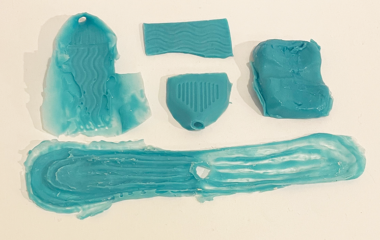
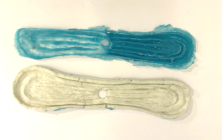
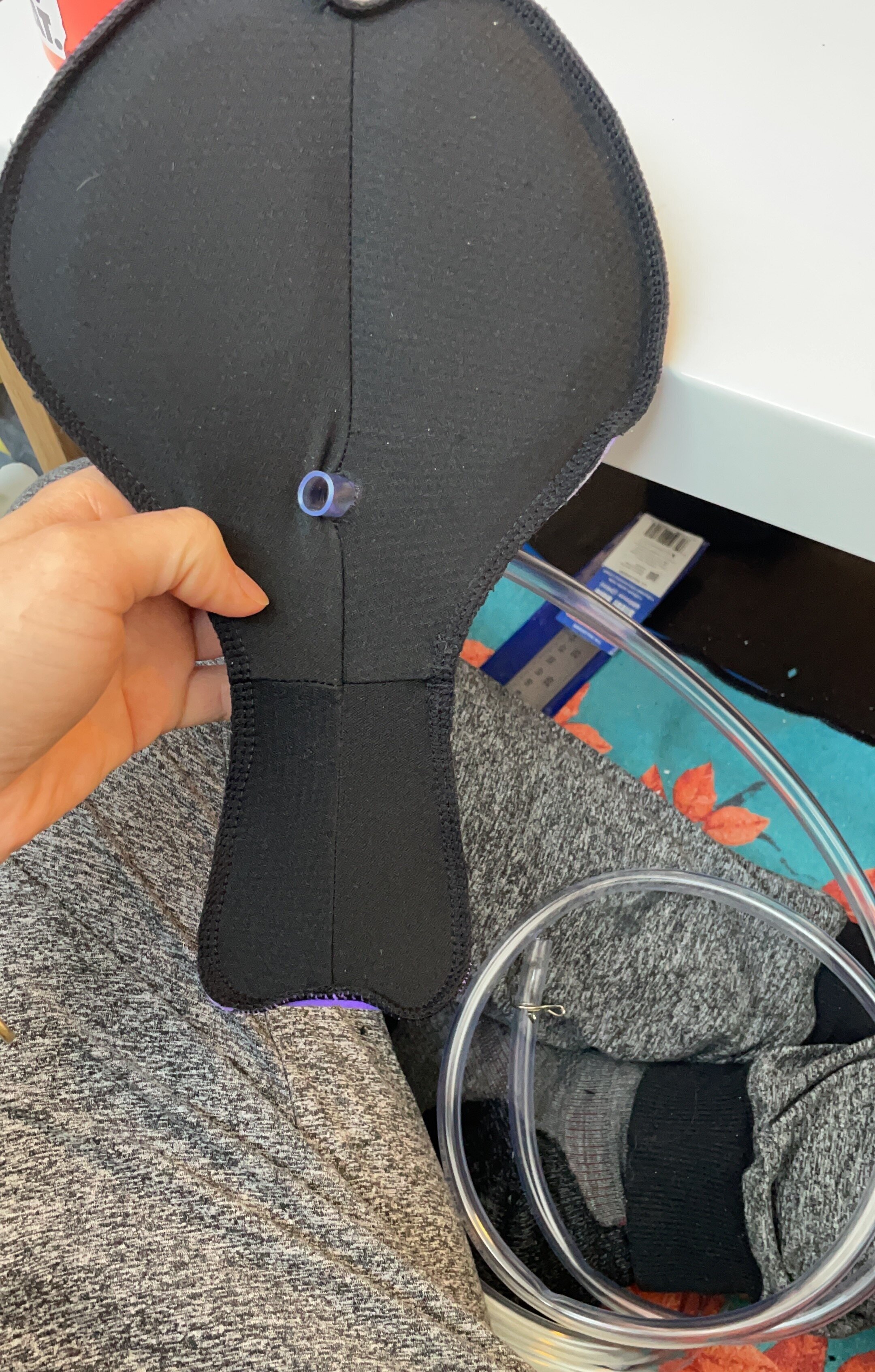
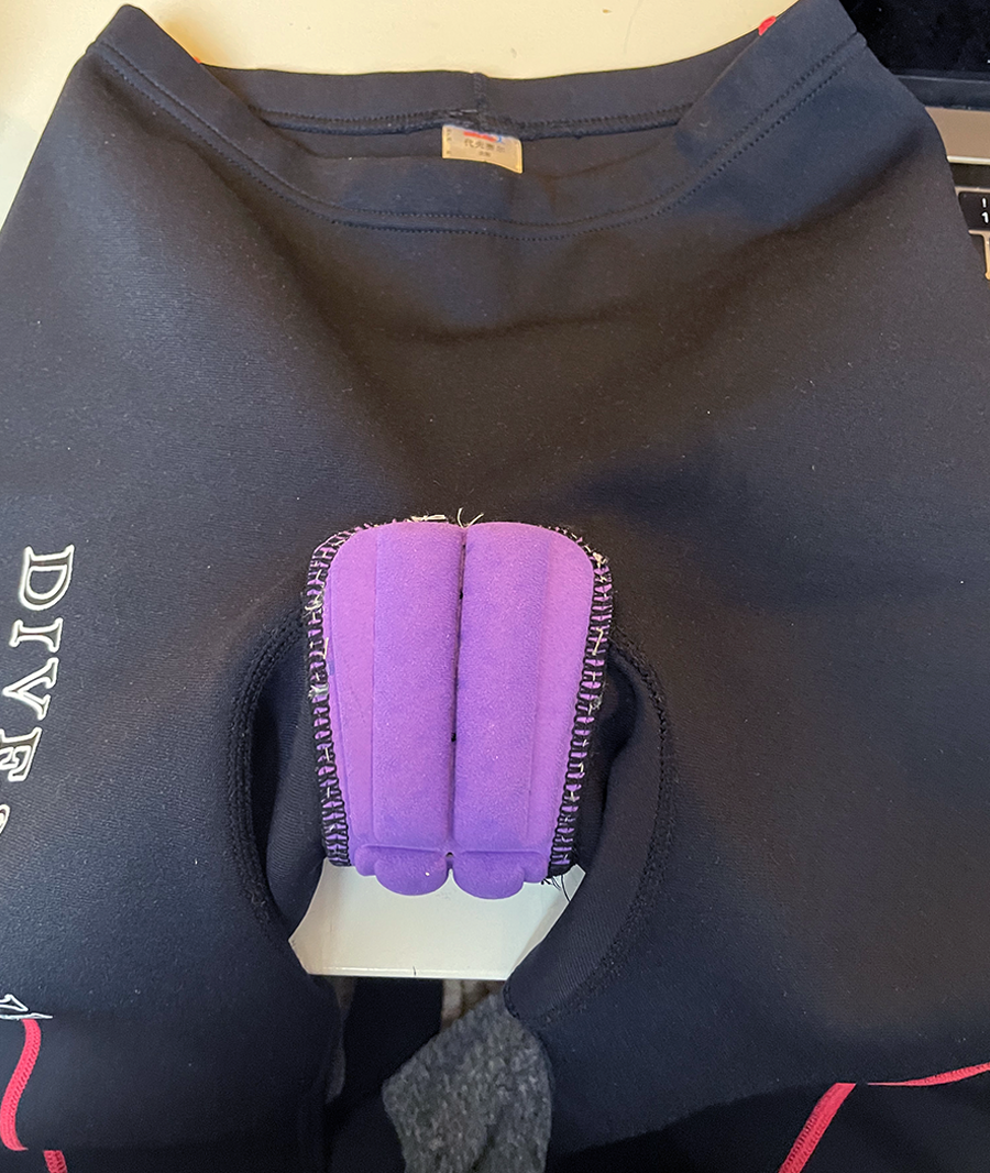
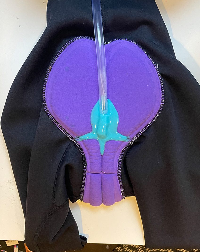
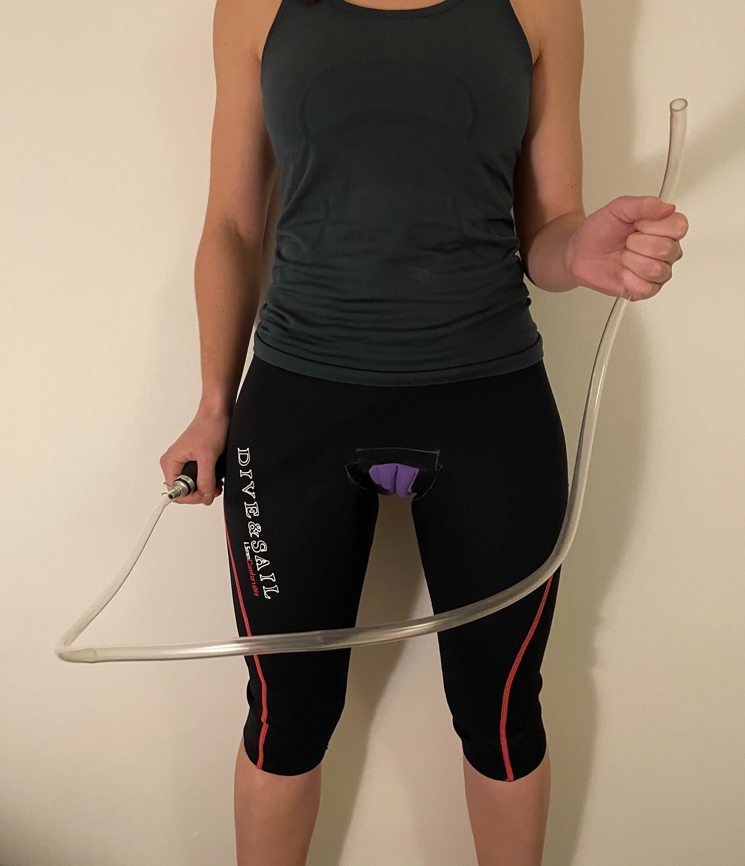
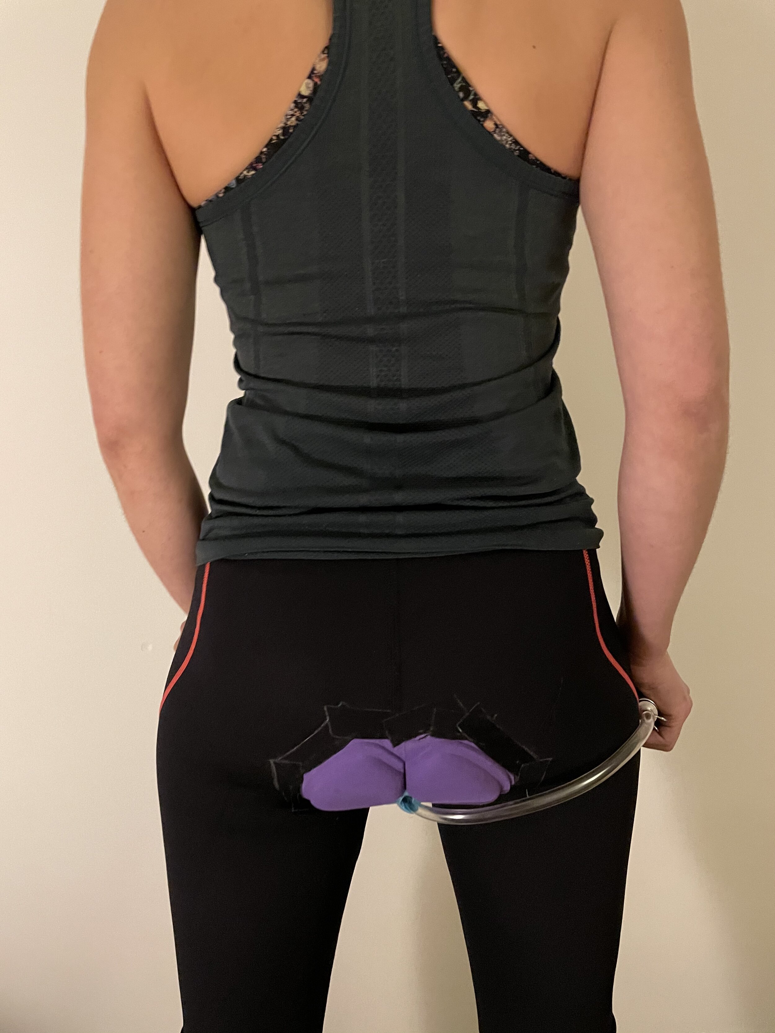
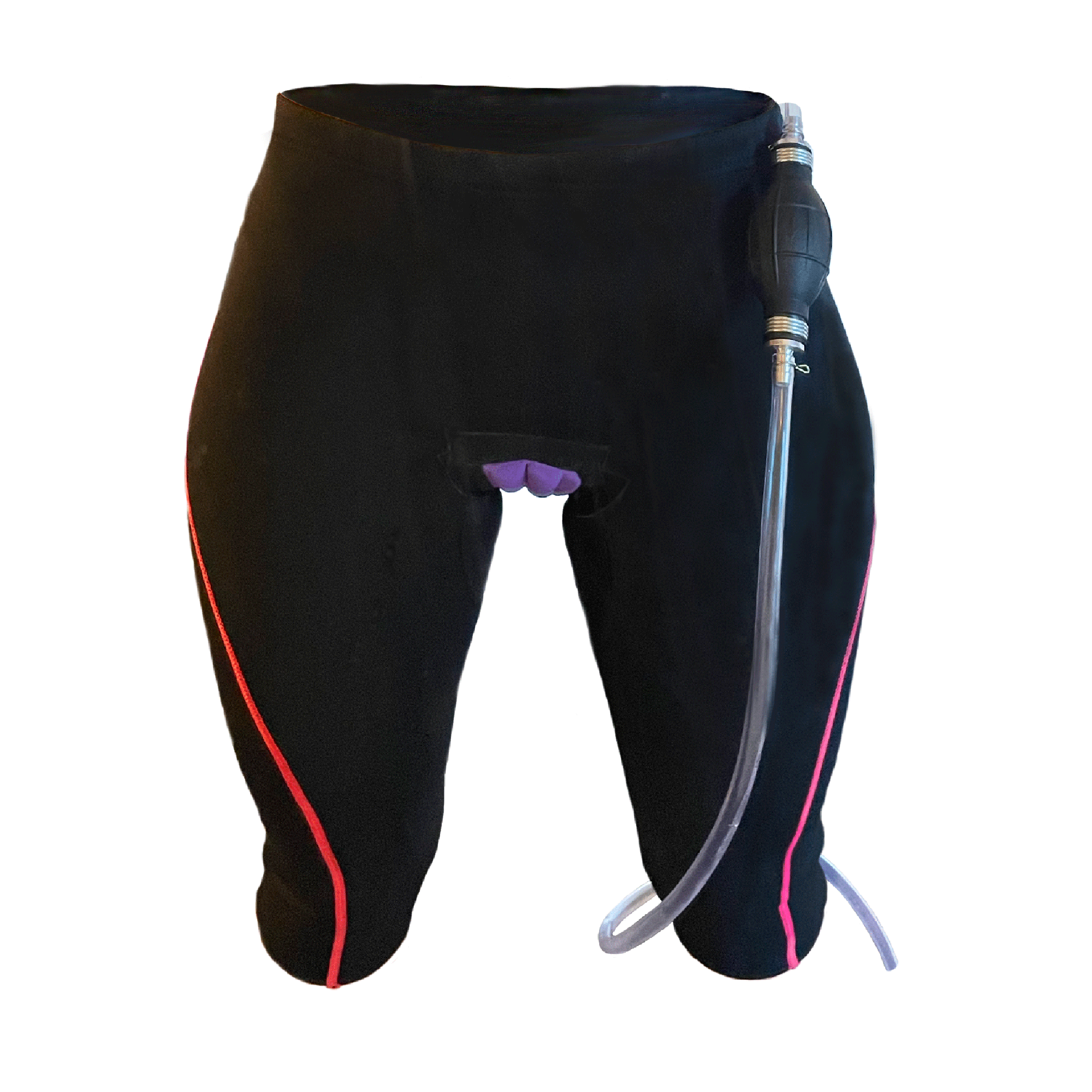
High fidelity prototype | Inflight urination system
After many trials I felt confident in creating a higher fidelity prototype that could be tested.
04
Prototype testing
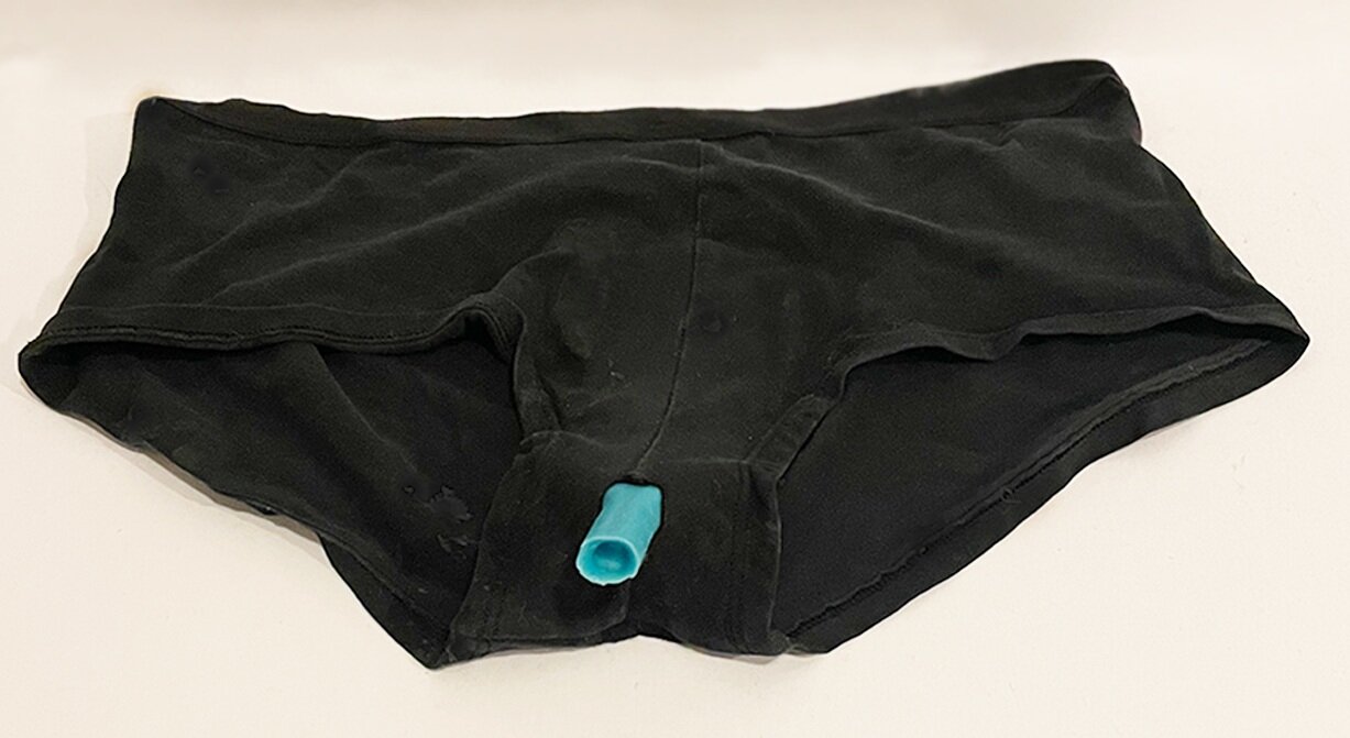
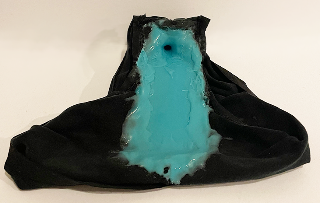
Testing | inflight urination system
To test this out I put it on and sat in the bathtub reclining how a paragliding pilot would sit while in their harness. Hard as I tried I really just could not get myself to relax enough to pee. This is a feeling that many female paragliding pilots have also had while trying to pee mid-air. Although unable to fully test this prototype properly, I was able to pour water into the pants and use the pump to mostly successfully dispel the water.
05
Ideation round two!
Back to the drawing board | expanding context and reintegrating feminism
After testing my prototype and receiving feedback on it, I decided that the work I had done, although useful as a design exercise, had taken a turn away from the largely feminist context that I had placed this project in. I decided to come up with a few more products that would take this project from practical to speculative.
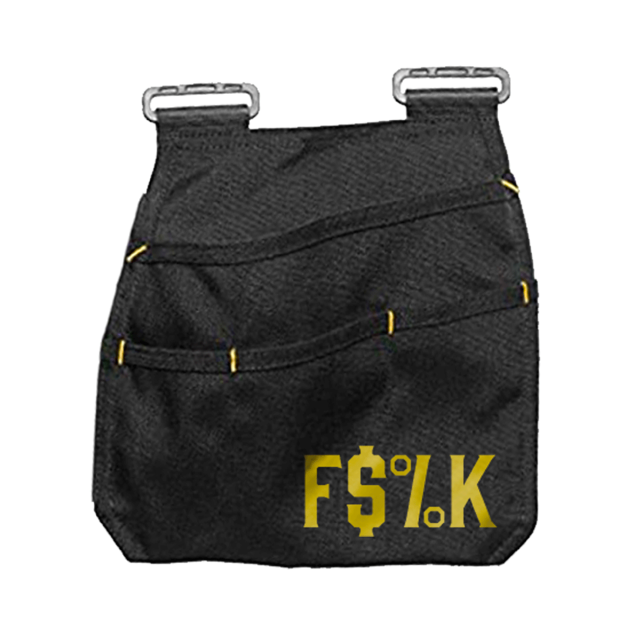
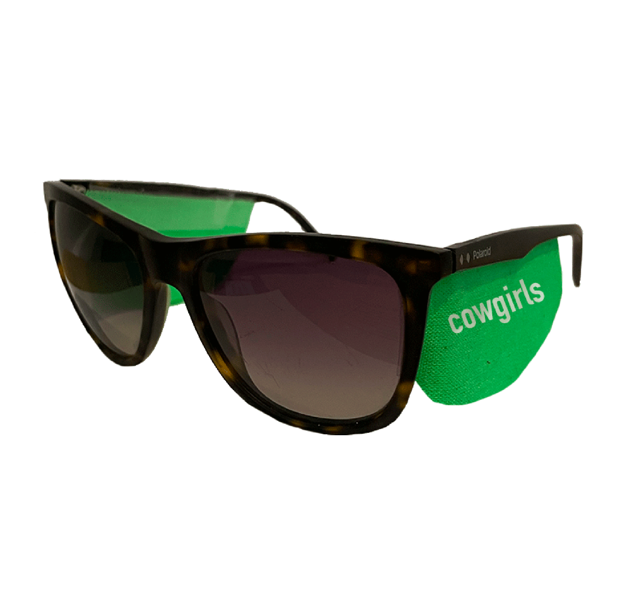
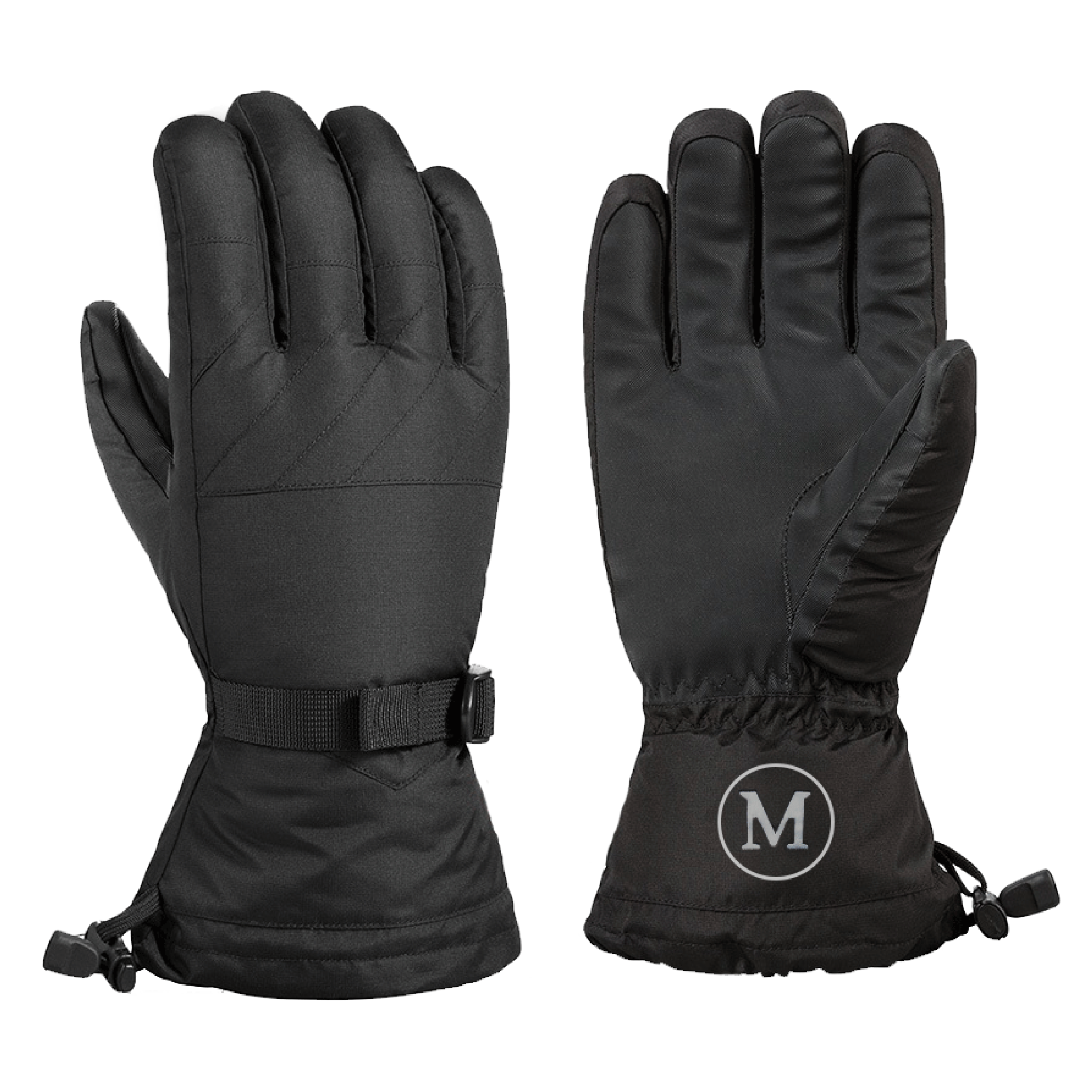
The four images below represent those additional products, including the urination system. Each one tackles an issue presented to women in outdoor gear. Meant to be funny and absurd, these products act as commentary about different outrageous outdoor gear practices.
More about these products in the next section.
Why a website? | Accessibility, universality, and of course covid
I wanted to create a place for these products to be consumed in a way that was accessible and comfortable. Most outdoor gear stores have an online presence so it made sense to create a commerce website. However, I also wanted this to be a space of learning and connecting for women who are otherwise shunted to the side in the world of outdoor recreation.


06
Website design
Design influences | The Guerrilla Girls and a little punk


Tone and copy | getting things going with a punch
I wanted the site to either shock and embarrass the viewer or to make them laugh… a little bit of both is alright too. The language I used throughout is very bold and raw. There is no sugar coating when it comes to taking down the patriarchy.

Visual design elements | type face, color, texture
Type and color | Drawing again from the Guerrilla Girls, I used Futura as my main typeface. Continuing on with the tradition of reclaiming the overly popular typeface family used for advertising in the 80’s, I used it in a way to spread an idea to a mass market.
One of the Guerrilla girls most popular adds “Do women have to be naked to get into the Met. Museum?”, had a huge influence in terms of color in my overall design. I was really paying homage to this badass lady force of feminist activism throughout this project. I adopted a similar color and feel for my images.
Texture | One of the main visual elements of the site is a ripping motif seen throughout. The idea, which influenced the name of the site “EXPOSED”, was to visually reveal all of the sextist practices occuring in the outdoor gear industry. When you get past the pretty colors and slim fitting gear, all you’re left with are items designed for men that do not work for women.

07
Website content
Website video walkthrough | website pages and capabilities
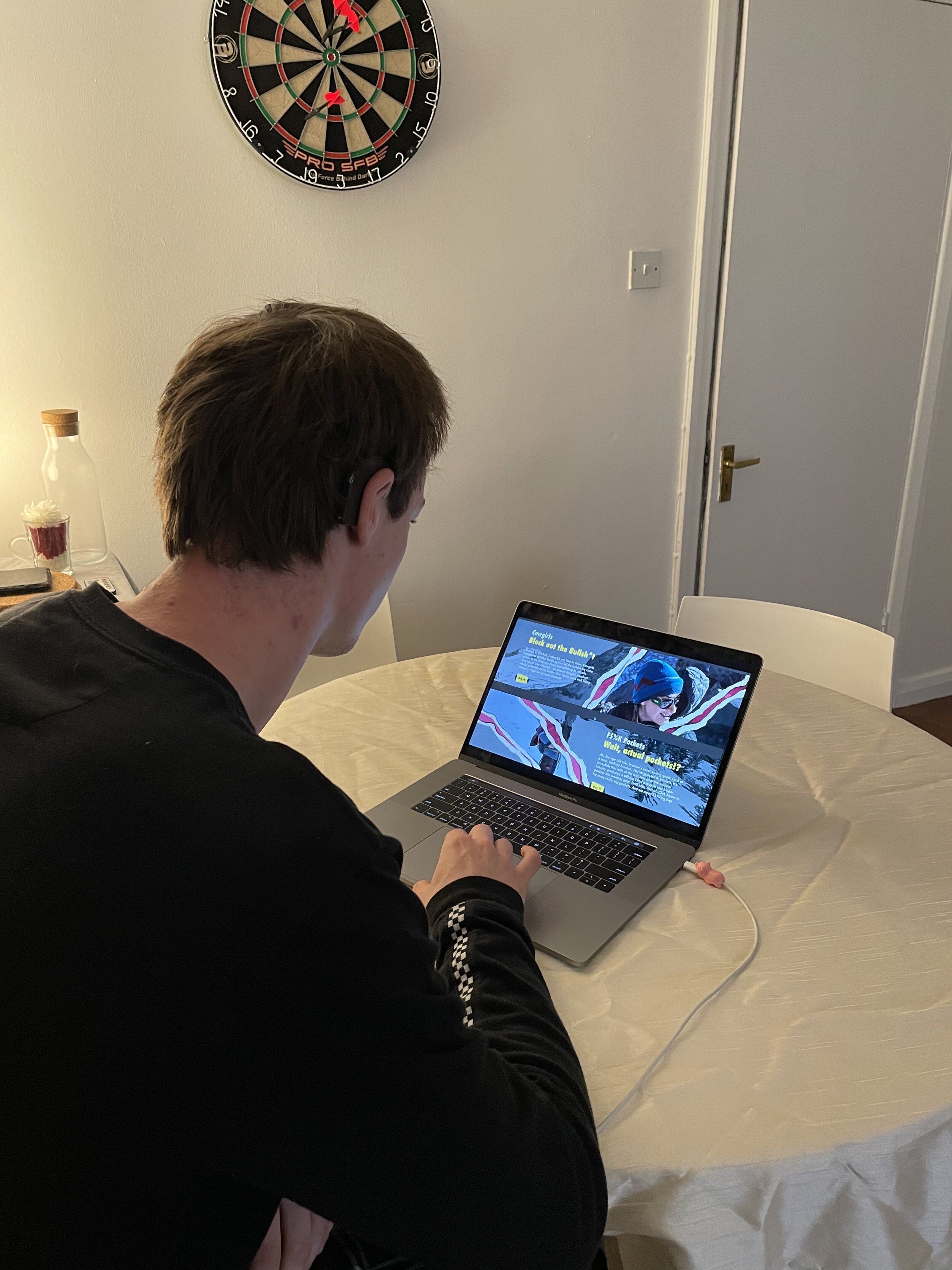
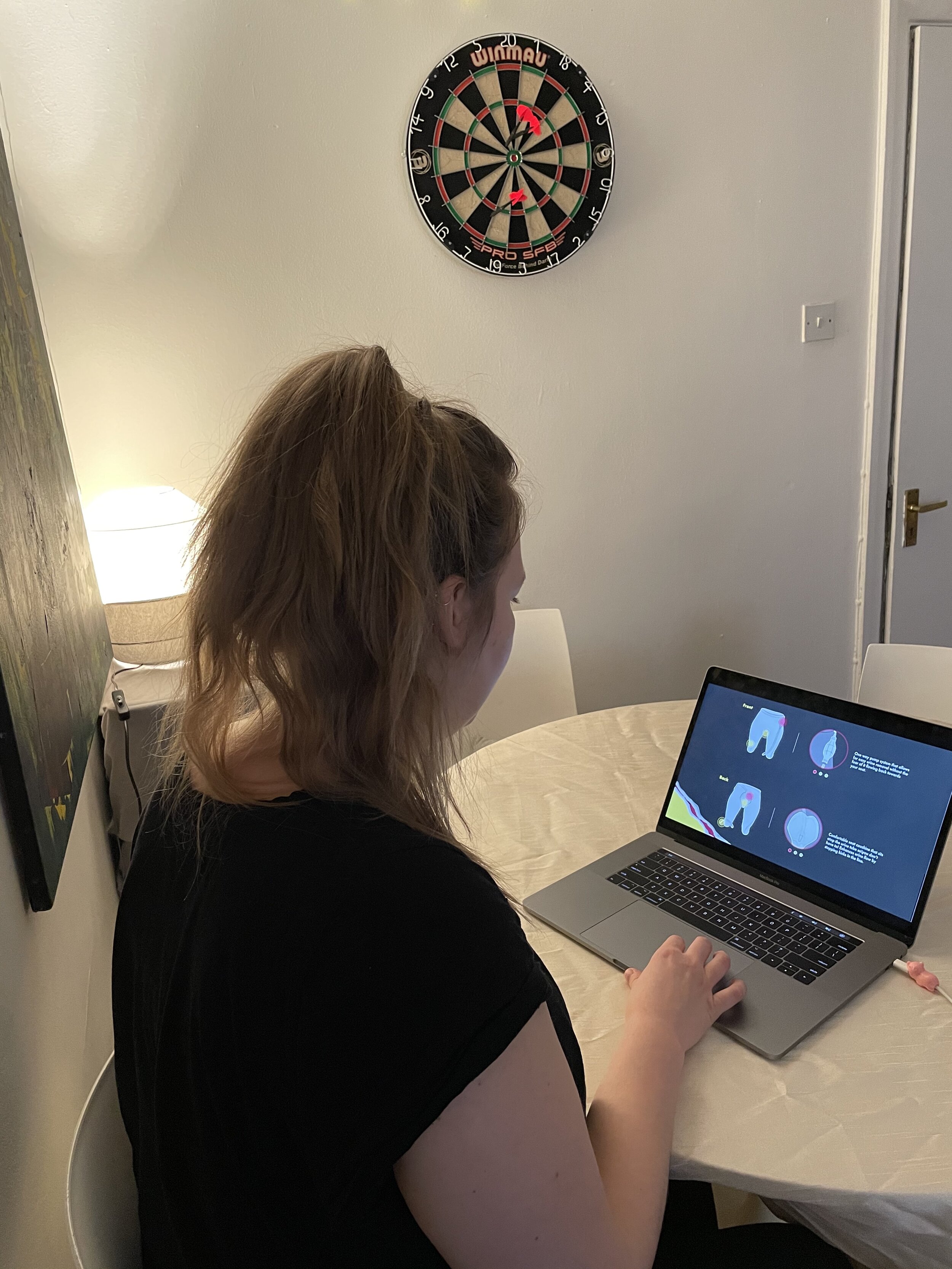
Shop page | Items on sale
There are four items for sale on the site. Each one points out an absurd practice in the outdoor gear industry while offering an alternative to a product normally difficult for women to find.

Shop page
Stories page | Ladies, it’s our turn to write the stories
The stories page is a place for women to share, connect, and celebrate each other’s accomplishments in the outdoors. It is meant to be a platform where they can feel safe and empowered.
For Men page | Some enlightenment
With yet another homage to the Guerrilla Girls, I started this page off with a letter to the outdoor gear industry. The For Men page is simply a resource for men to become a bit more enlightened about half of the population.
08
Website testing
Points of views | usability and meaning
Testing the website was fairly straightforward except for the challenges that covid presented me with. I was able to test the website mainly over zoom with 9 women and 9 men. I was also able to test with a few in-person which helped greatly.
The overall feedback was positive. The usability was simple and understandable. Where feedback differed was between women and men. The women all found it funny and engaging. Some of the men were none too pleased, taking offense at first. However, after further explanation of the site and its purpose, some came around.